Style Customization
To tweak the theme of the component you can redeclare variables in CSS custom properties. Don't forget to place the CSS file with redeclared variables below the component's CSS file. Redeclaration of CSS custom properties looks like this:
 .idvc {
   --btn-border-radius-big: 40px;
   --color-background-white: #000000;
 }
The component has the following customizable properties:
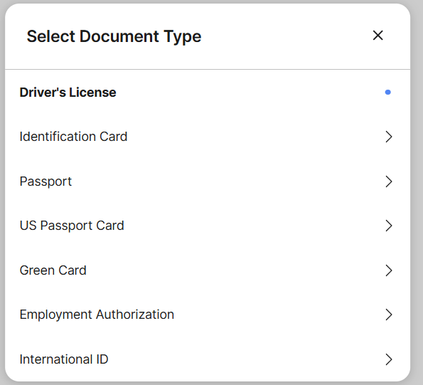
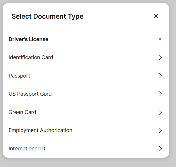
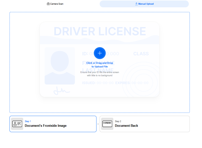
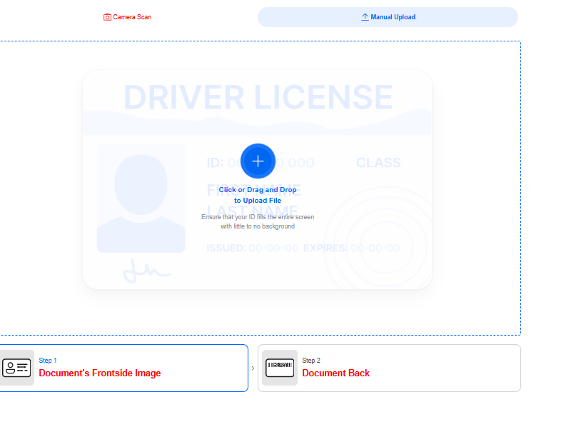
--border-color-divider default: #E4E7ED
- message box's default border color
- "select document type" menus's devider
Normal state:
Changed state:
--btn-border-radius-big
default: 4px
- radius of retake, continue, submit buttons
Normal state:
Changed state:
--btn-border-radius-small
default: 4px
- radius of the manual switch button
--color-background-white
default: #FFF
- uploader's background
- background of 'result' modal window container
- background of 'type not defined' modal window -1 background of 'document type-hint’ section
Normal state:
Changed state:
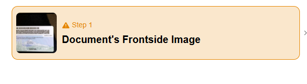
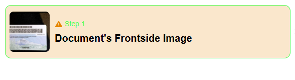
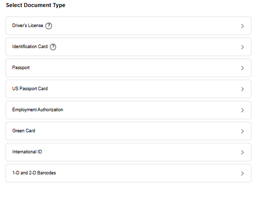
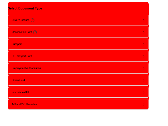
--border-color-base
default: #DCDFE6
- border of 'type not defined' modal window select
- border of 'document type-hint' section
- borders of top part in 'steps' section
- bottom icons of inactive step in 'steps' section
- image background in 'steps' section
Normal state:
Changed state:

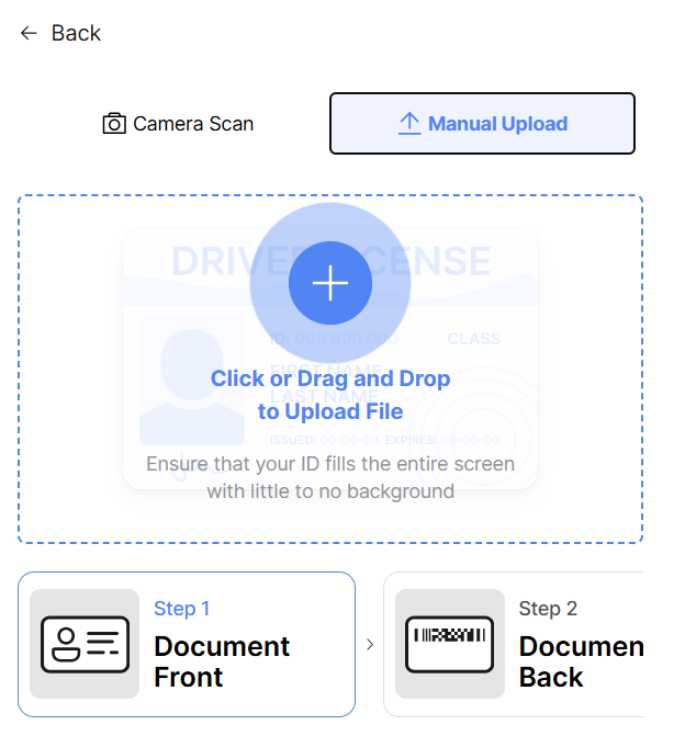
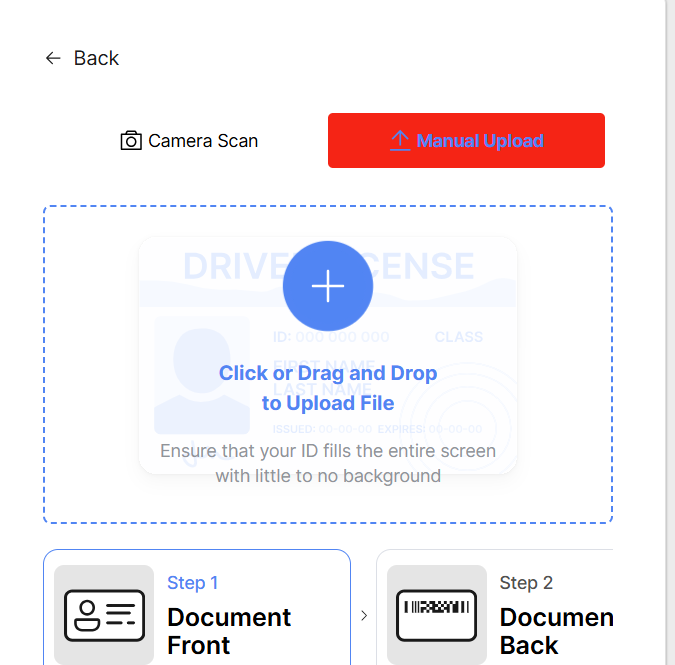
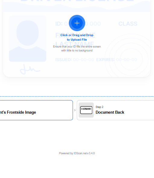
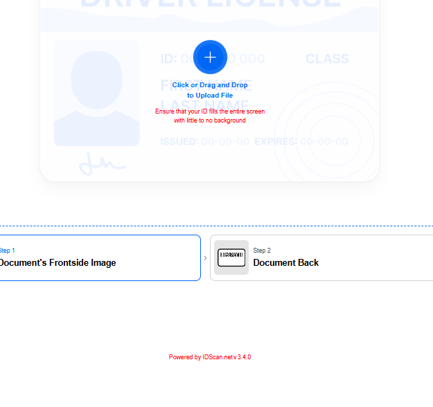
--color-loader-primary
default: #5185F3
- background of primary buttons
- active step name, icon, and bottom line of the active step in 'steps' section
- uploader labels, border
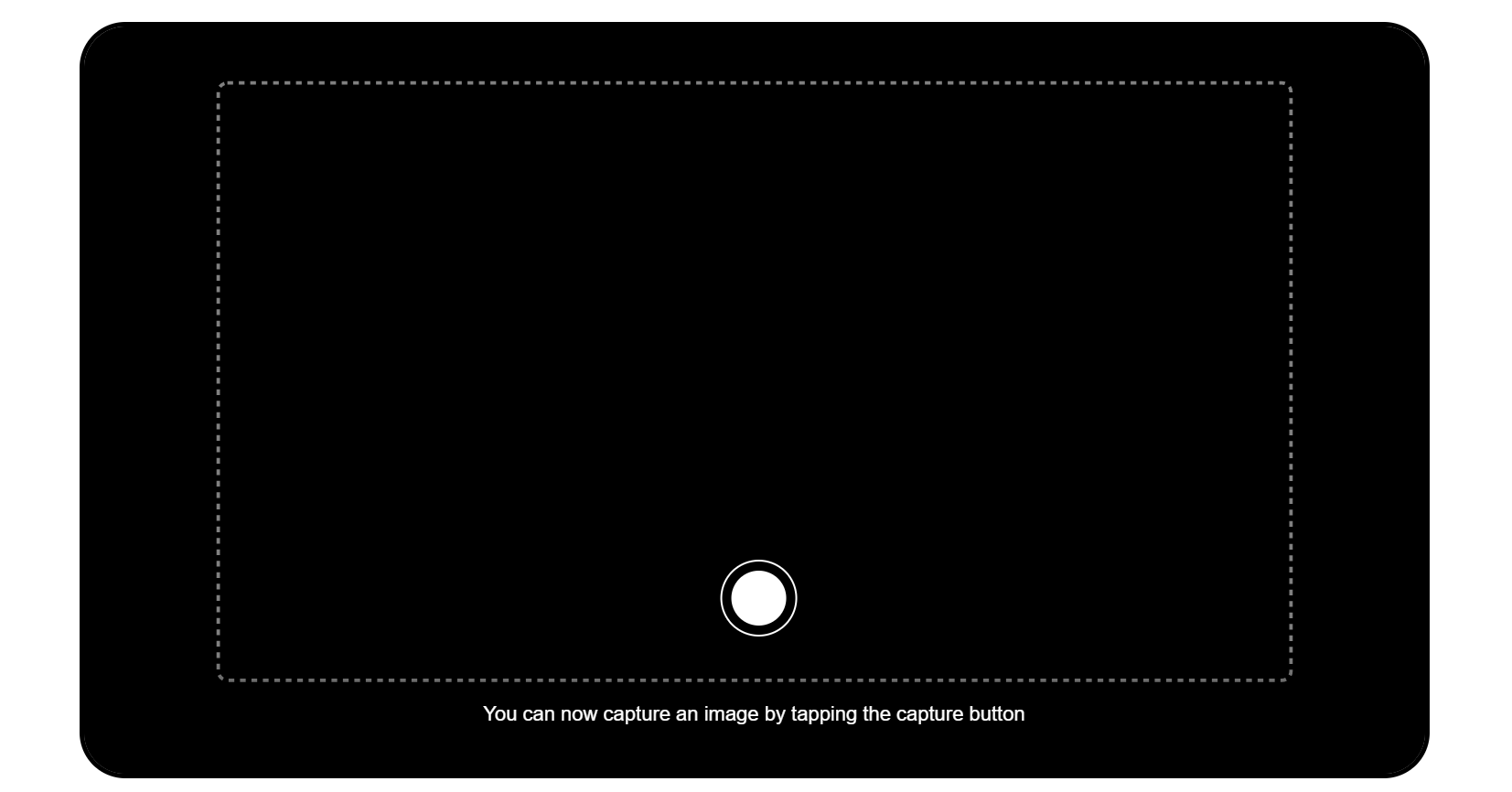
- manual take picture button in video capturing
- change the document type in 'document type-hint' section
- step name on hover in 'steps' section
- guideline inscription
- background of the upload icon in the uploader
- uploader's emphasized descriptions
- disabled primary buttons
- disabled button border
- spinner's color;
Normal state:
Changed state:
--color-loader-secondary
default: #A0C1FF
- secondary loader's color
Normal state:

Changed state:

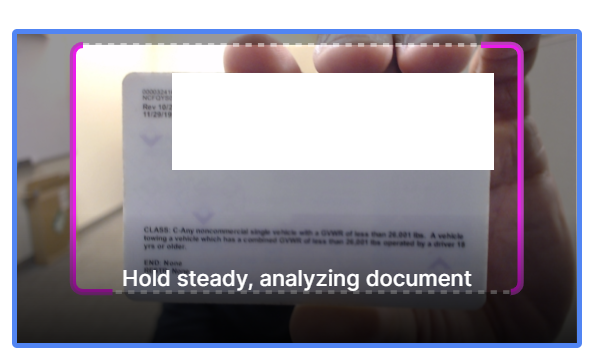
--color-positive-light
- success frame on capturing
Normal state:
Changed state:
--color-primary-dark-2 default: #2C75FF
- color of the wording when web library is loading
Normal state:

Changed state:

--color-primary-light-9 default: #E6F0FF
- camera scan and manual upload button color
Normal state:
Changed state:
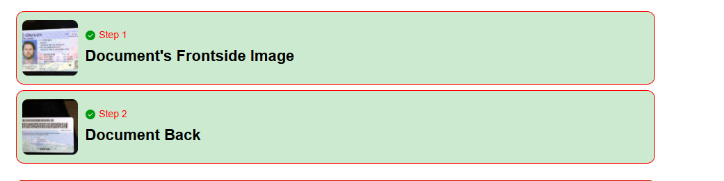
--color-success
default: #13CE66
- succeeded steps in 'steps' section
- face shape when capturing the video in face step
- capture progress
- valid sign of 'result' modal window container
- hints on video capture
- background of uploader's success sign
Normal state:
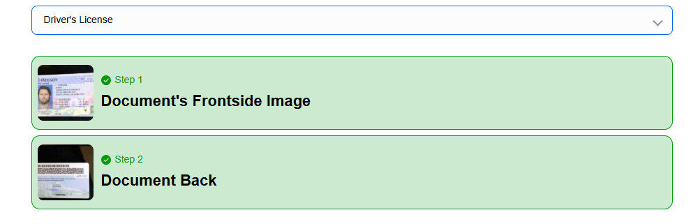
Changed state:
--color-danger
default: #FF4949
- background and bottom border of the step error in 'steps' section
- header of 'type not defined' modal window
- invalid sign of 'result' modal window container
- license error text
Normal state:

Changed state:

--color-warning
default: #FFC632
- warning sign of uploader
Normal state:
Changed state:
--color-text-secondary
default: #909399
- scrollbar of 'result' modal window
- library version
- descriptions of the uploader
- close sign of 'result' modal window
- name of the inactive step in 'steps' section\
Normal state:
Changed state:
--color-black
default: #000
- face shape icon in video capturing when the face is not detected at the face step
- shadow of 'type not defined' modal window
- caption of 'type not defined' modal window select
- uploader's bold descriptions
- shadow of 'result' modal window
- bottom border of 'result' modal window row
- options of change the document type in 'document type-hint' section
- uploader's error sign stroke
- uploader's error description
Normal state:
Changed state:
--color-white
default: #FFF
- caption of buttons
- border and caption of manual take picture button
- upload icon
- header description of 'type not defined' modal window
- uploader success sign's checkmark
- description of capture progress
Normal state:
Changed state:
--font-family default: Inter,'Helvetica Neue', Arial, sans-serif
- font family of all text in the component
Normal state:

Changed state: